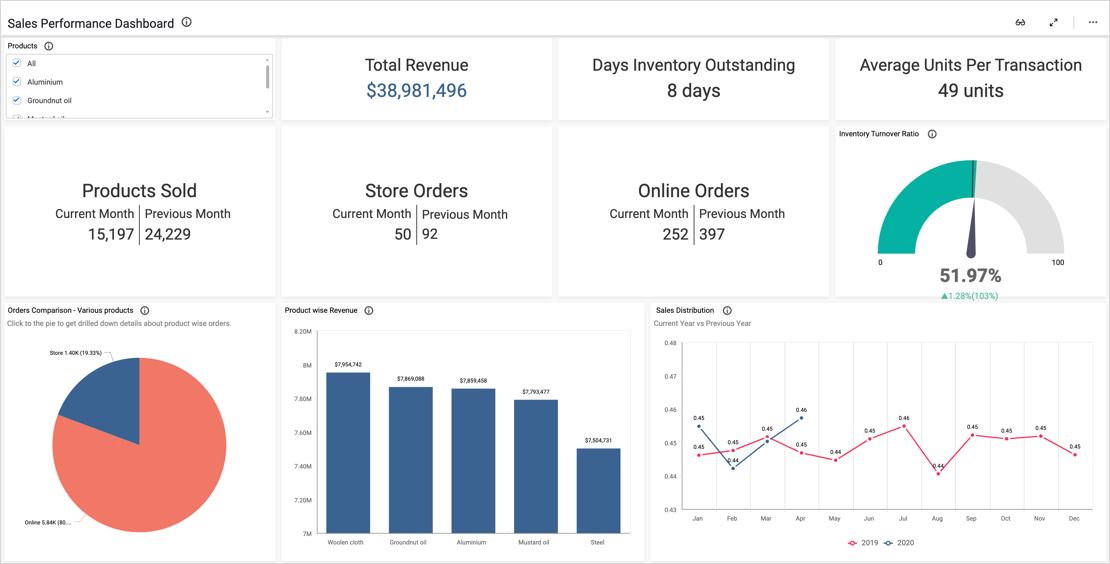
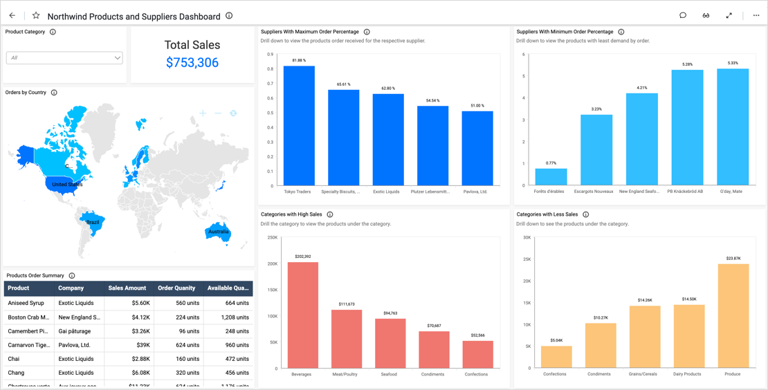
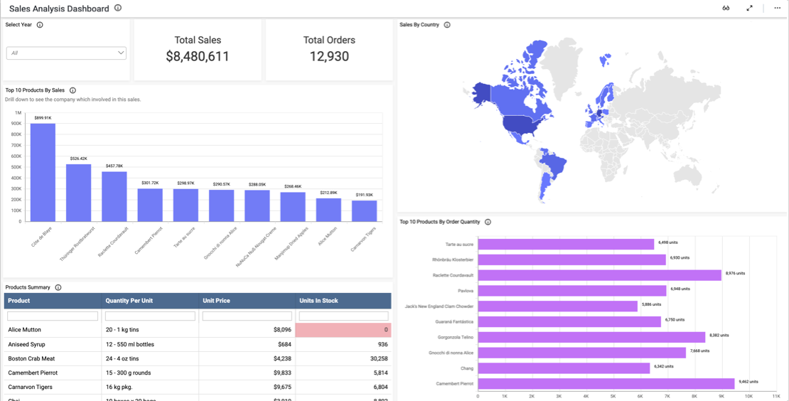
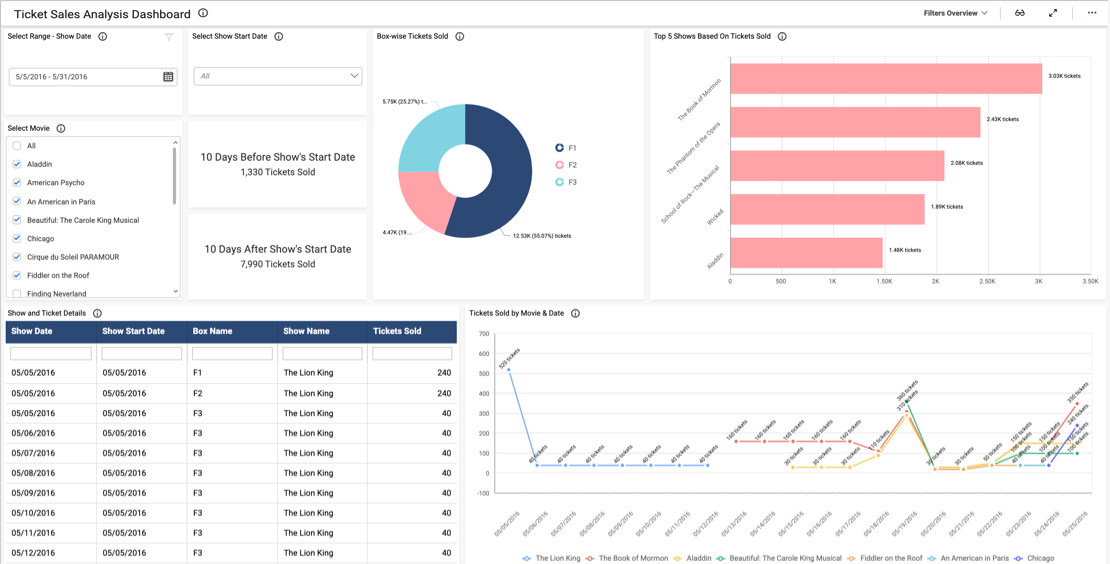
- Firstly, what are our expenses and revenue?
- What is our net profit? Also, how do these figures compare to the previous month?
- How many online and in-store sales do we have?
- Finally, how old are our accounts receivable?
Track Key Financial Metrics and Analyze Broader Trends
By tracking KPIs such as revenue, expenses, and net profit, leaders can ensure the team is achieving its big-picture goals. We can quickly see this data by viewing the card widgets at the top of the dashboard. Further, these cards allow viewers to compare this month’s numbers to last month’s so the team can easily track its progress. Also, the card displaying the company’s predicted revenue provides further insight into the company’s financial path and could help leaders plan for future months.
Meanwhile, with the in-store and online order pie chart, we can see how many sales (in dollars and as percentages) came from the Internet versus brick and mortar stores. This information can help the team ensure that inventory, personnel, and other resources are allocated appropriately.
For example, if most sales are online orders, more staff will be needed in warehouses, and shipping costs may need to be factored into the company’s financial plans. It is also worth noting that this pie chart utilizes the multi-level drill down feature. This means viewers can click a segment of the chart to view a more detailed breakdown of its data. For instance, by clicking the “Store” or “Online” sections, viewers can see a more detailed breakdown of sales by company.
Finally, the AR Age bar chart illustrates the ages of outstanding invoices. This data could help leaders determine where resources should be assigned to increase the chances of obtaining payment in a timely manner.
Filter Your Data
One key feature of this dashboard is its versatility. With the “Product” and “Date” drop-down list box filters, viewers can display data for any combination of products sold within a given date range. Users can reset the filters by clicking the funnel-shaped icons in the upper right corners of the list boxes.
The “Revenue by Region” map also functions as a filter; by clicking a state, users can view data for that state alone. This feature is invaluable for users who need to focus their analysis on specific sets of data.

