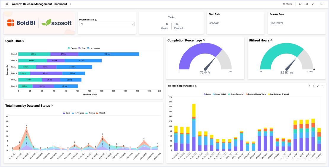
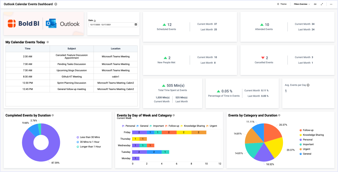
- Firstly, how many planned and completed work items do we have?
- Secondly, how can we sort these tasks by type and priority?
- Thirdly, what are our bug statuses? Also, how do our bugs break down by severity?
- Finally, what is our sprint velocity?
Review Key Sprint Details
The two card widgets at the top of the dashboard track changes in the number of bug reports and feature requests.
Then, with the “Planned vs Completed Work Items” chart, leaders can make sure the team is on track to meet its weekly goals. Further, the “Priority” bar graph organizes each work item by type and priority. This provides a quick visual reference for the number of outstanding tasks and their importance.
Also, the dashboard’s pie and doughnut charts offer insight into bug status and severity, letting viewers know how many tasks are outstanding and how urgent they are.
Finally, the “Sprint Velocity” bar graph details each sprint’s velocity, allowing leaders to track the team’s progress over time and identify any outliers.
As you can see, an Azure DevOps dashboard can help leaders ensure that priority tasks are addressed quickly and track the team’s progress throughout a sprint.

