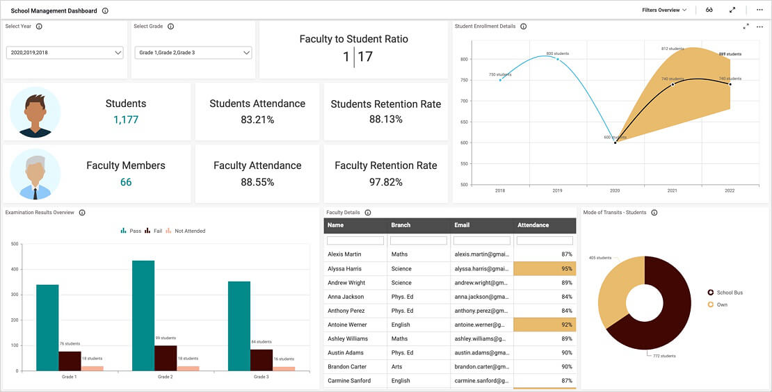
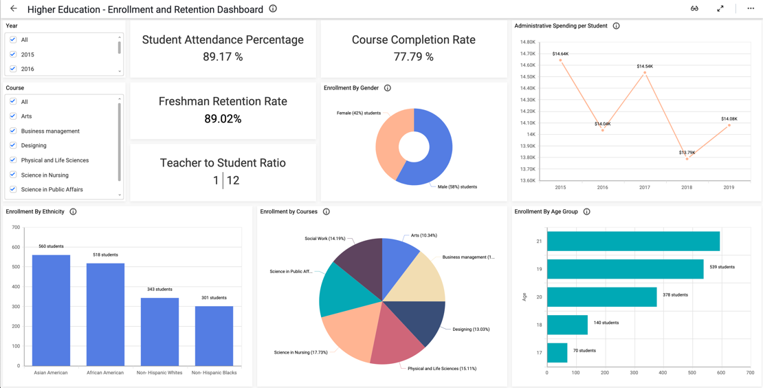
- Firstly, what is the faculty-to-student ratio?
- Secondly, how has our enrollment changed each year? Also, what is the forecast for the next three years?
- Thirdly, how many students are taking advanced courses?
- Finally, how has our budget changed each year?
Analyze Key Enrollment Data
With the Enrollment Trends line chart, administrators can easily track changes in each year’s enrollment. This widget also offers a forecast of what enrollment might look like over the next three years, allowing leaders to plan for the future and allocate resources accordingly. Further, the Top 5 School Districts bar chart displays the five districts with the most students.
Next, the Acceleration Program line chart shows the number of students taking advanced courses each year. Finally, the Operating Budget spline chart shows yearly changes in the schools’ budgets.
Filter Your Data
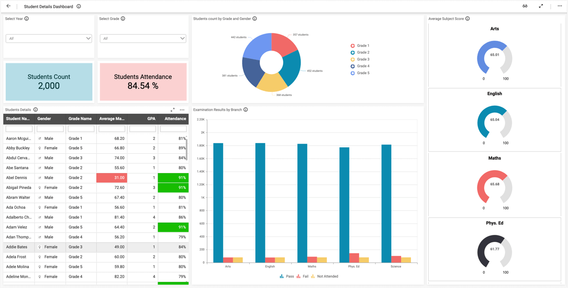
By using the year, district, school, and grades drop-down list box filters at the top of the dashboard, viewers can customize the dashboard to display data for any combination of these categories that they wish to see. Users can reset the filters by clicking the funnel-shaped icons in the upper right corners of the drop-down list box widgets. This feature is especially valuable for leaders who wish to focus their analysis on specific sets of data.


