- Firstly, was the support team able to help customers?
- Secondly, which professional fields do customers work in?
- Thirdly, are customers happy with the company’s products and services?
- Fourthly, how long have customers used the company’s products?
- Finally, do customers say they would buy the product again?
Review Survey Analysis Metrics to Improve Your Business
This dashboard can help company leaders understand customers’ opinions of their products and services, making changes where necessary to ensure customer satisfaction.
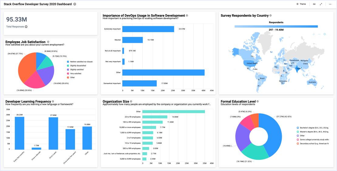
With the bar chart at the top left corner of the dashboard, leaders can review customers’ experiences with their support team. Other widgets, such as the Customer Satisfaction pie chart and Repeat Customer Likelihood pie chart, detail customer satisfaction ratings and how likely the customer would be to buy the product again. Similarly, the Customer Retention bar chart outlines how long respondents have been using the company’s products, offering insight into customer satisfaction and loyalty.
Next, with the Product Preference donut chart, leaders can see which brands customers would prefer if they were to opt for a competitor’s product. Finally, two widgets–the Respondents heat map and radar chart–offer insight into customers’ age groups and professional fields. This data can help the company better understand who is interested in their products, and they can adjust their product offerings and marketing efforts accordingly.


